A few years ago, I was deep in the trenches of redesigning a series of pricing pages. My company operated on a SaaS subscription model, and we needed a fresh approach to our pricing structure. It quickly became clear that designing a pricing page isn’t just about making something look good—it’s about making something work. There’s no one-size-fits-all best practice, and that can make the process challenging. But when you create a design that functions well and truly serves the user, it’s incredibly satisfying.

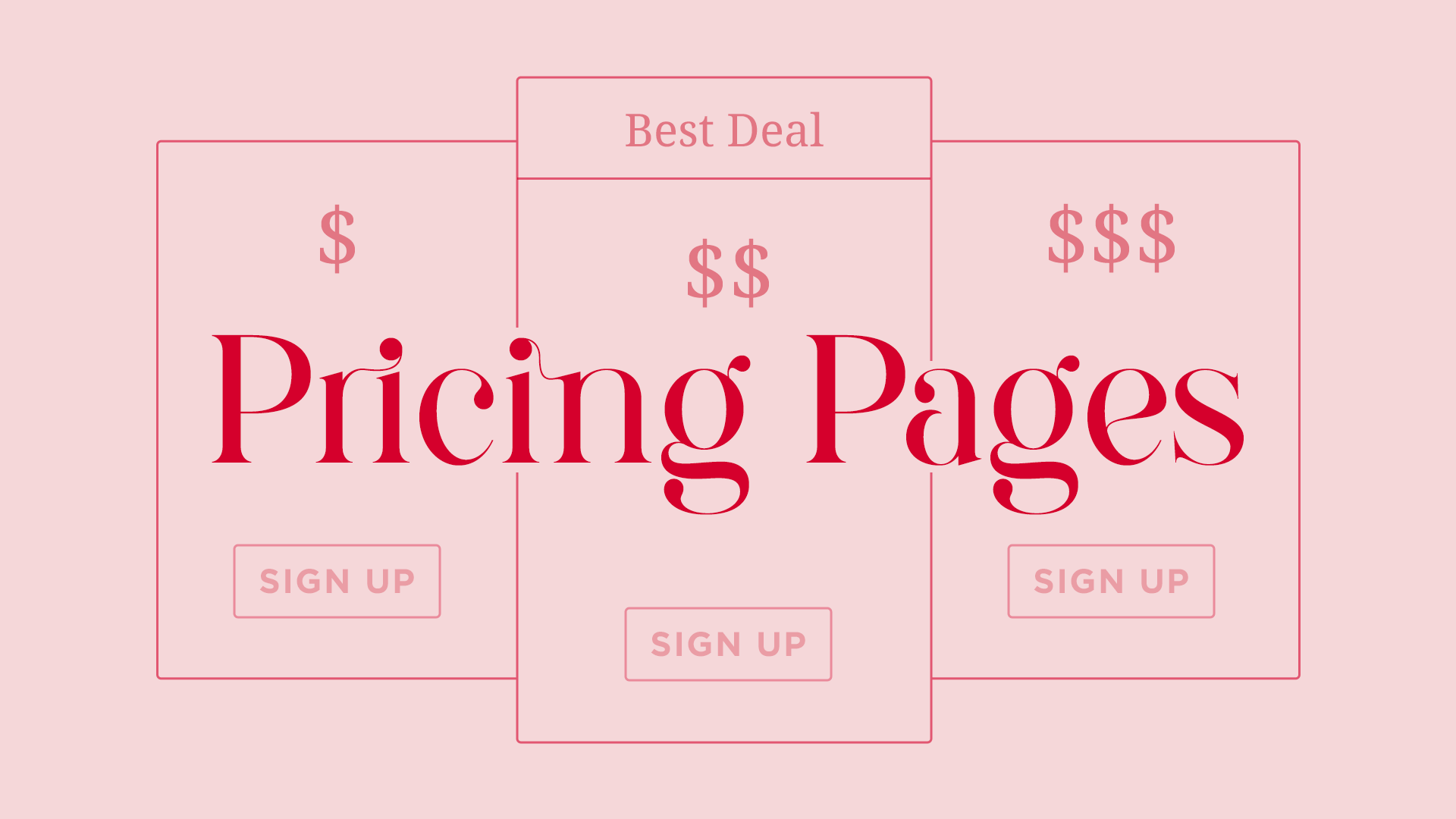
This is one of the designs I was working on at the time.
Content Comes First
You can design a page to perfection, but if the content itself is confusing, no amount of good UI will fix it. Pricing pages often involve complex information, and if it’s not clearly structured from the start, the design can only do so much. Stay in close communication with the people handling pricing strategy, and don’t be afraid to flag unclear areas. If you’re struggling to make sense of something, chances are the user will, too. That said, as a designer, your role is to present the information as clearly and concisely as possible.

The New York Times only has one pricing tier, but it covers all the necessary information.
Hierarchy Is Essential
Typography, spacing, and visual emphasis play a huge role in guiding users through a pricing page. If a user can’t quickly find or understand key details, they might move forward without fully grasping what they’re signing up for. The challenge is that if everything looks important, nothing stands out. The key is to identify the most critical elements—pricing tiers, plan differences, and calls to action—and make sure they’re visually prioritized without overwhelming the user.

Adobe's pricing seems simple enough, but some of their content — like what "annual, billed monthly" means — can easily get skipped over by the user.
Keep It Simple (Even When It’s Tempting Not To)
At one point, I got fixated on using a slider for price selection. I knew from research that sliders often create usability issues, but I saw others using them and thought it would be more engaging than a standard dropdown. However, the feedback was all over the place—some people liked it, others found it frustrating. That inconsistency was a red flag. When I revisited my research, it confirmed what I already suspected: I wasn’t keeping it simple. The mixed feedback came from the fact that people were interpreting the interaction in different ways. In the end, I scrapped the slider and went for a clearer solution.

Figma has a very detailed pricing page. Are they keeping it simple? How could they improve?
Prioritize Essential Information
Pricing pages can easily become overwhelming, especially if they try to answer every possible question upfront. The key is to show the most important information first—what the user needs to make a decision—without cluttering the page with too many details. Additional information should be available, but it shouldn’t compete for attention.

Grammarly sticks to the most important information first, while still incorporating details.
No One Has It 100% Figured Out
It’s always helpful to see what others are doing in the same space, but don’t assume that any one company has the perfect approach. Pricing pages evolve constantly—I’ve seen them change overnight. Everyone is trying to find the best way to communicate value while making the purchasing process seamless. Keep an eye on trends, but trust your research and instincts.

Netflix changes its pricing pages fairly often, and it prioritizes a lot of different information.
Let’s Connect
I’d love to hear your thoughts—what challenges have you faced when designing or working with pricing pages? Have you come across any particularly great (or frustrating) examples? Let’s chat! Feel free to connect with me on LinkedIn drop a comment below.