After an era of exclusively freelancing, I’m job searching for a more permanent situation.
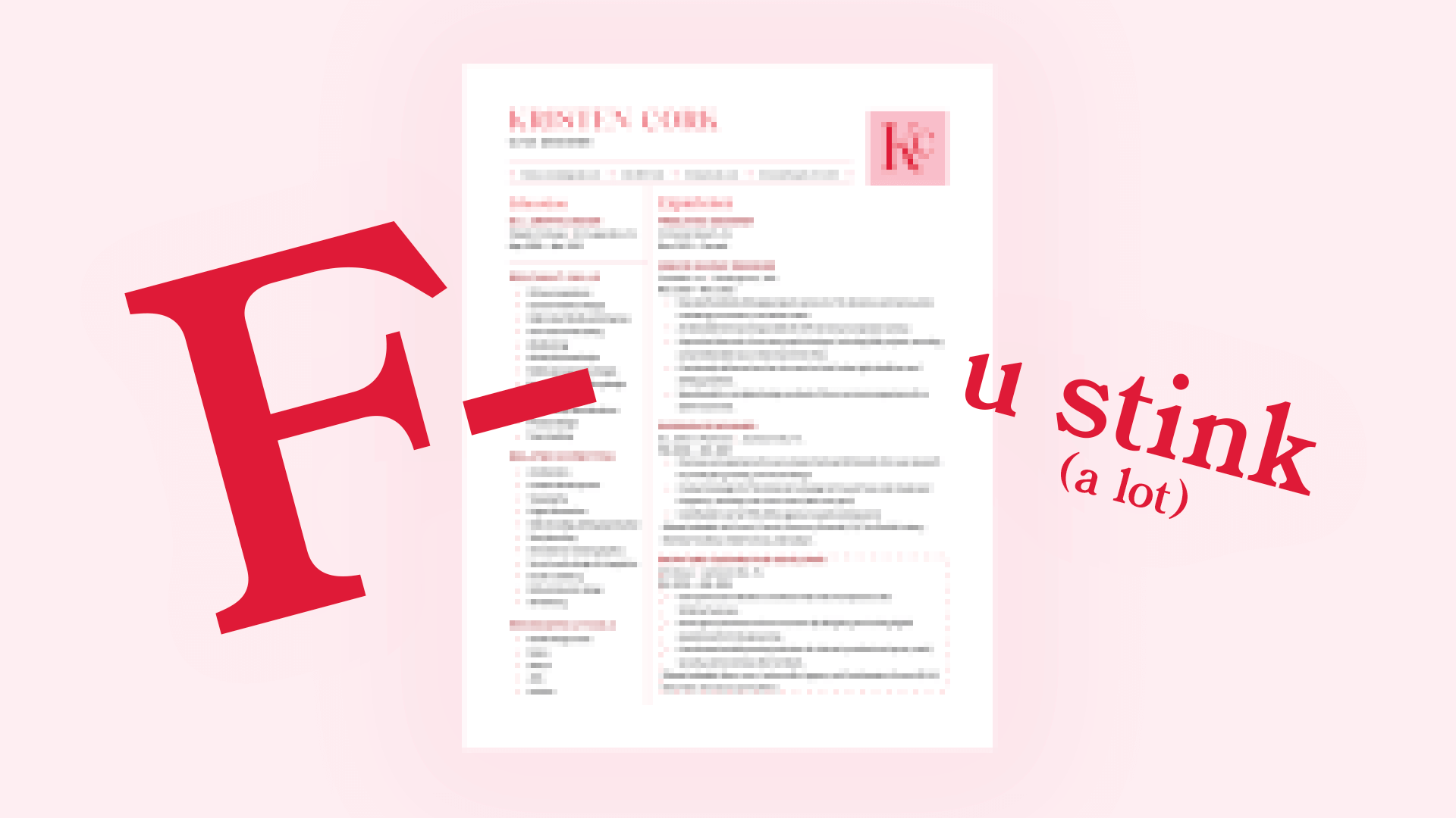
It turns out my “perfectly” designed resume sucks — according to the bots who “read” it before shuttling it through to real people.

The robots, when they read my pretty resume.
There are systems called ATS — applicant tracking systems — that process resumes for 99% of Fortune 500 companies (Jobscan, 2019). They process many resumes and look for information key to the applicable job.
Unfortunately, this means it’s not looking for a beautiful design but precise information.
Although my former resume may have looked pleasing to human eyes, it’s not serving its functional purpose.
If my design isn’t accessible to the system, it might as well not exist. It’ll be discarded and never reach its desired audience.
It hit me this morning that there is a clear parallel between designing for function and digital accessibility.
Digital accessibility means removing barriers to digital media (websites, tools, etc.) so people with disabilities can interact with content (Digital Accessibility, Georgetown Law, 2023)

Everyone should have equal access to the web.
Essentially, it’s creating equity in digital spaces.
Getting used to “sacrificing” beauty for functionality can be frustrating until it becomes clear that functionality is the foundation of good design.
It’s like cutting into a beautifully decorated cake to find out it was frosted styrofoam.

Fun fact: a decorated styrofoam cake is called a “dummy cake” and can serve a purpose. Just not the purpose of getting in my belly ☹️
Accessible design can look good. After I wrestle it into submission, my resume will look good, too.
The important thing is letting go of the idea that accessibility ruins design. It often strengthens and improves it by making things more accessible and precise for everyone.
I’m excited to connect with like-minded professionals who value both beauty and usability in design. Let’s chat! Find me on LinkedIn.


